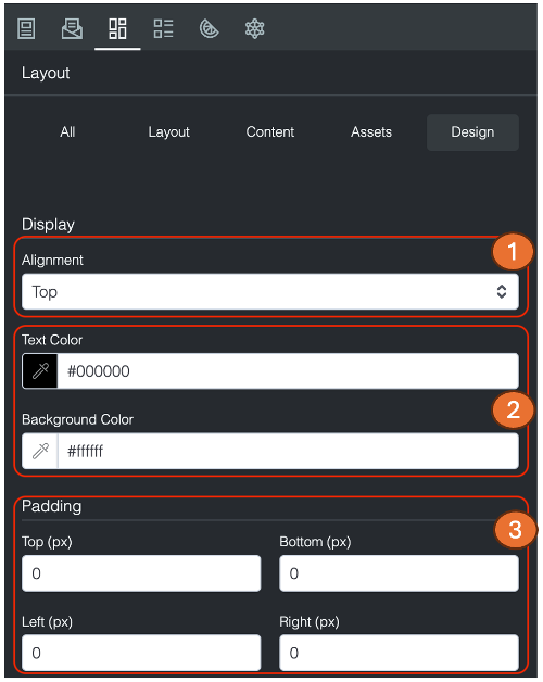
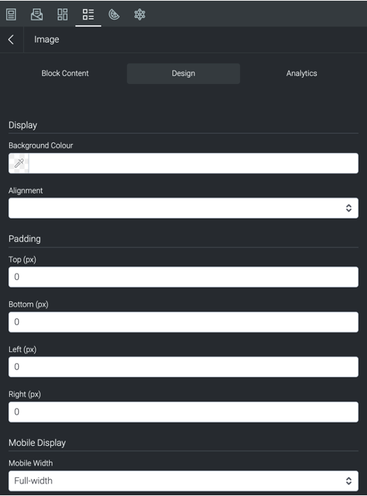
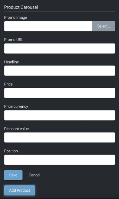
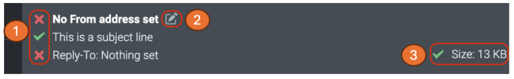
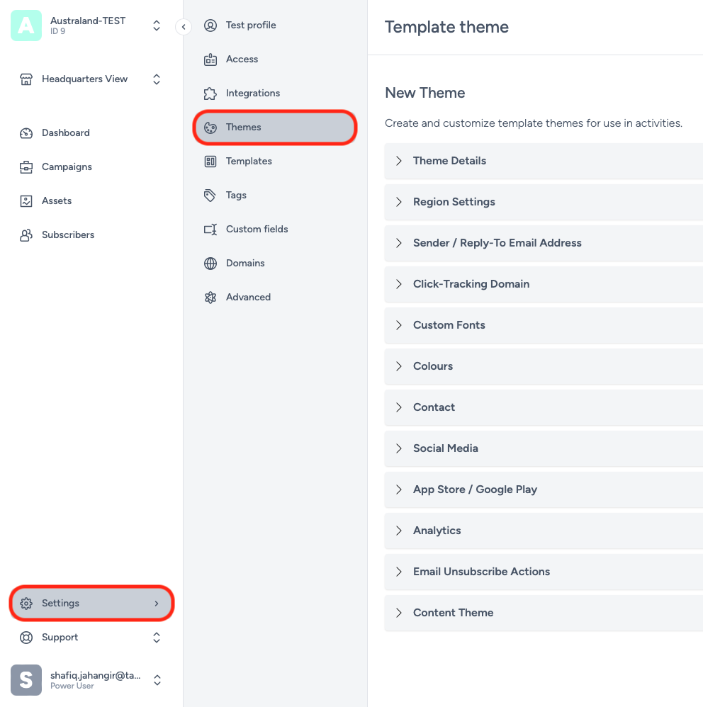
Here’s a short explanation of each of the customisable options available:
Theme Details
Within Theme Details, you can add the brand name, theme name and the description of your theme.
Region Settings
Region settings allows you choose the language for your theme for character font support.
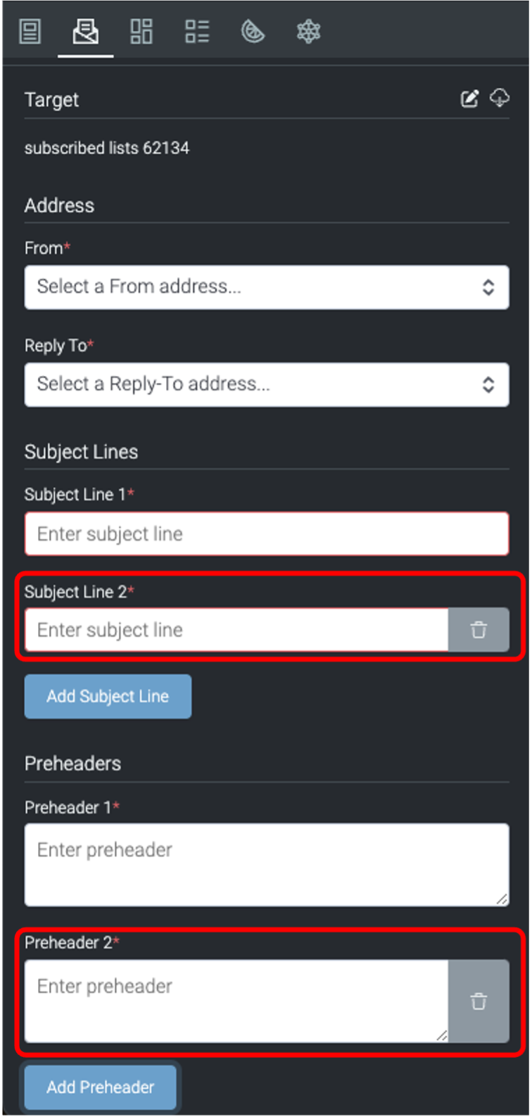
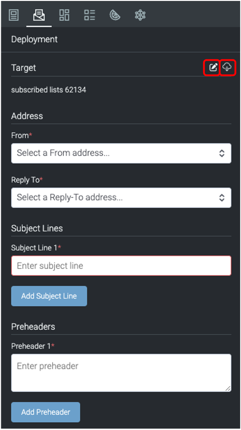
Sender / Reply
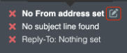
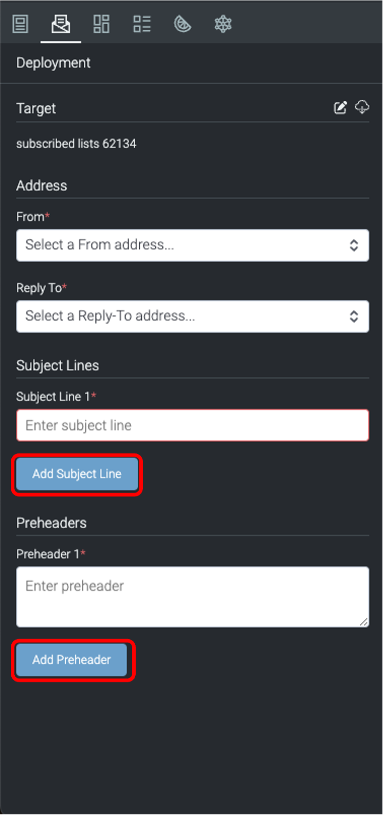
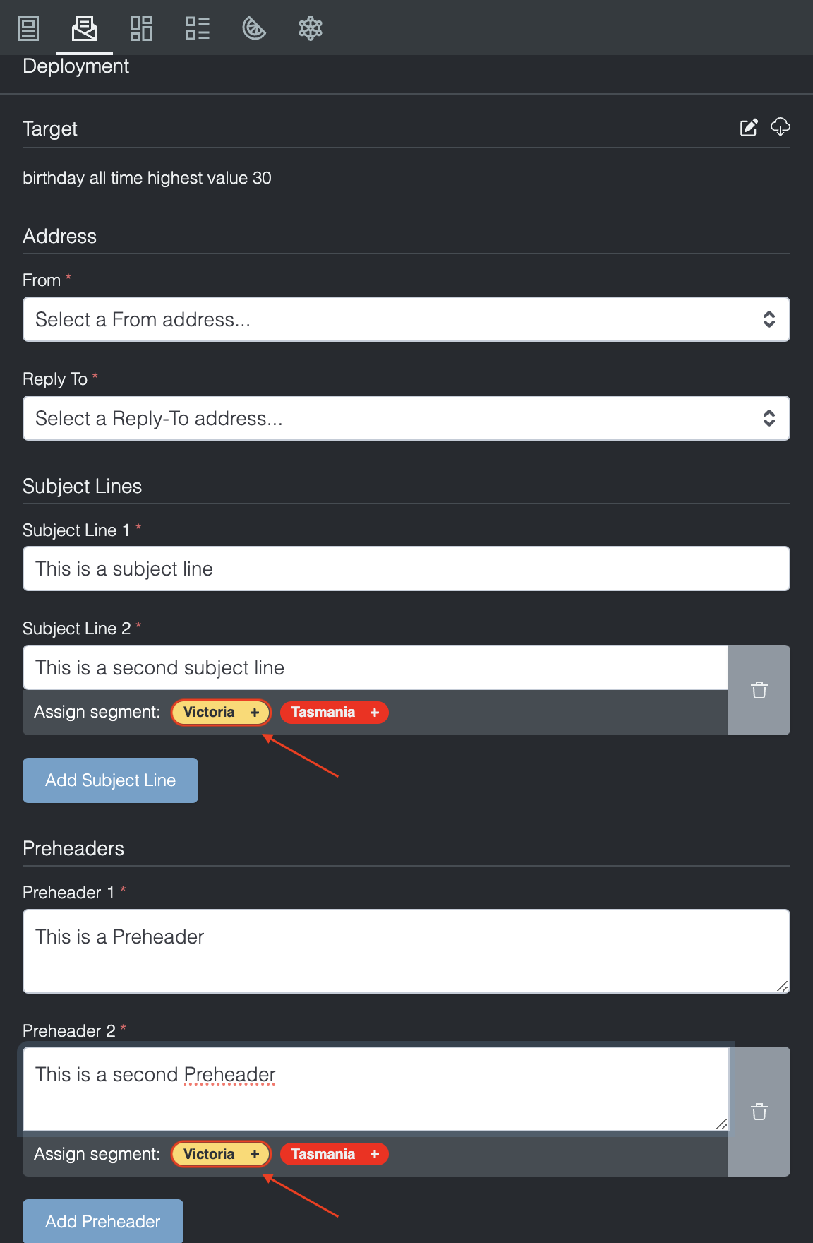
To Email Address - You can add the Sender and Reply-To addresses here by typing your Display name, username and selecting a domain name which has already been authorised in the Domains tab.
The Sender and Reply-To addresses that you add here, can be selected within the deployment tab in the activity editor.
Click-Tracking Domain
When there are multiple click-tracking domains set up in your organisation (in the Domains tab), this section allows you to select the one that applies to this Theme.
Custom Fonts
The custom fonts settings allow you to import fonts that are not in the default font picker by adding a link to the custom fonts URL input field. A fallback font style can be implemented which will display to users who are unable to view the imported custom font. Once custom fonts are created, they will appear in font pickers within activities that use this theme.
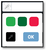
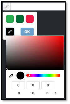
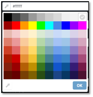
Colours
The colours section lets you set custom colours for the colour picker within the activity editor.
You can set the default URLs for Contact Us and Social Media platforms.
This section allows you to set up default social icons and their associated URL’s. A standard selection of social media platforms is available for selection and icons are pre-set but can be overridden. You can select the colour scheme for your social media icons, size and alignment.
App Store / Google Play
This are is to facilitate the insertion of your app download links. Icons are standardised and respect the Apple App Store and Google Play Store brand guidelines.
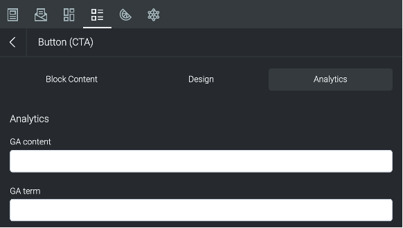
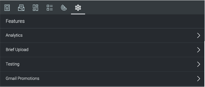
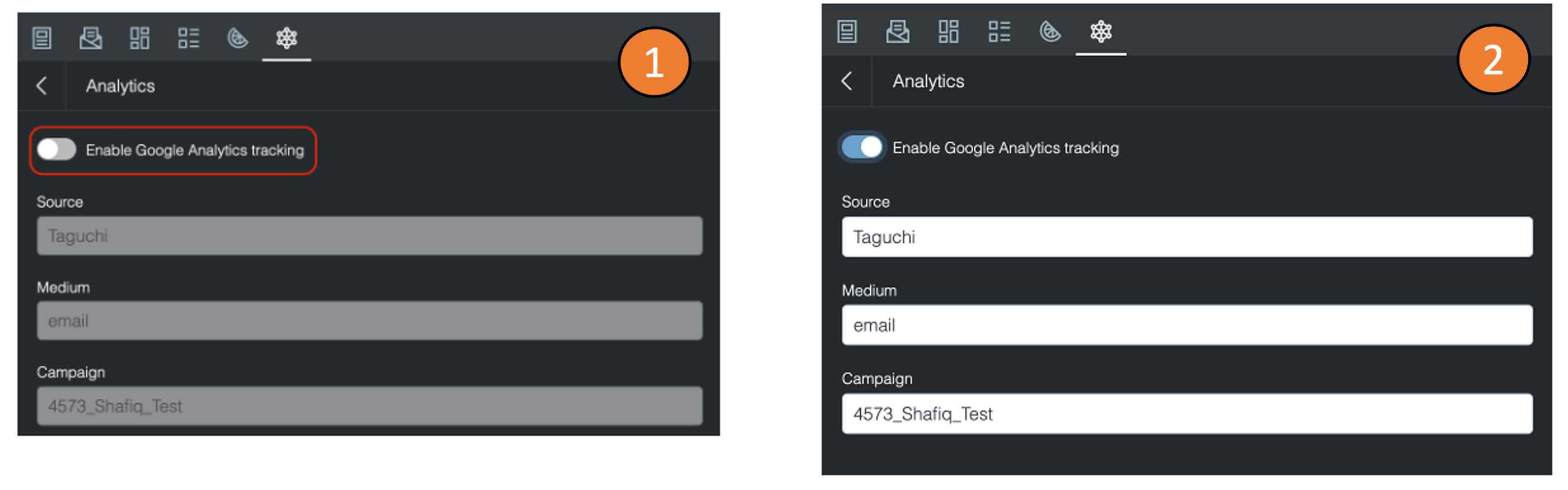
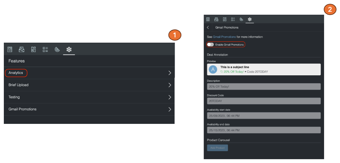
Analytics
This section allows you to set up your Google Analytics tracking parameters. You can select how your Campaign, Medium and Source gets populated for this theme. You can choose between Static Value, Dynamic Value, Custom List, or Editable within the Activity.
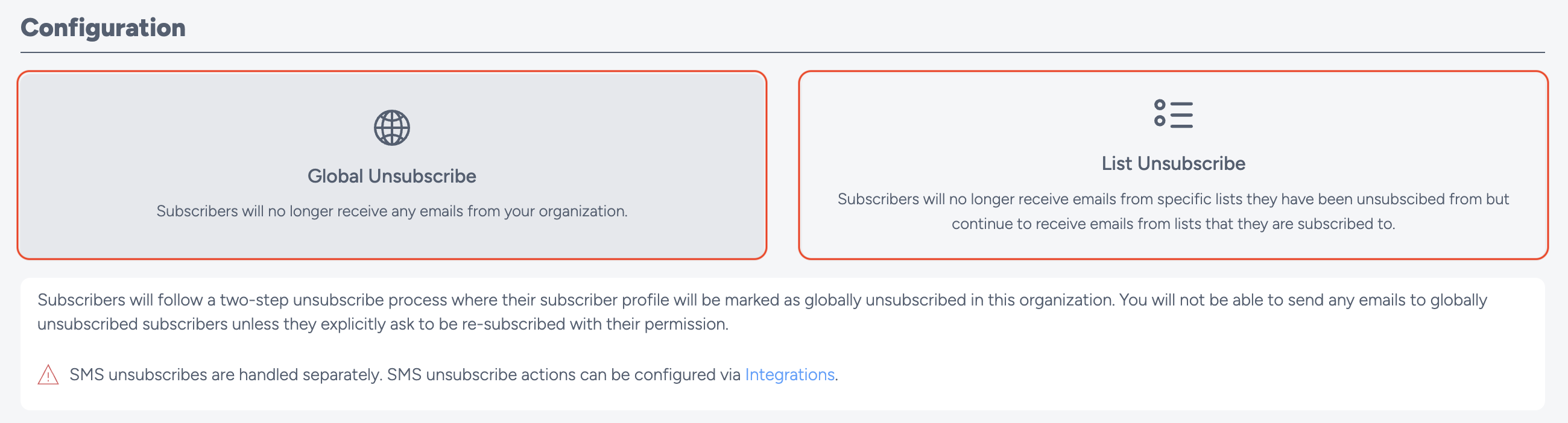
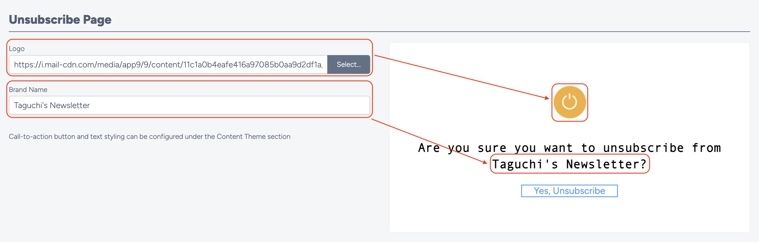
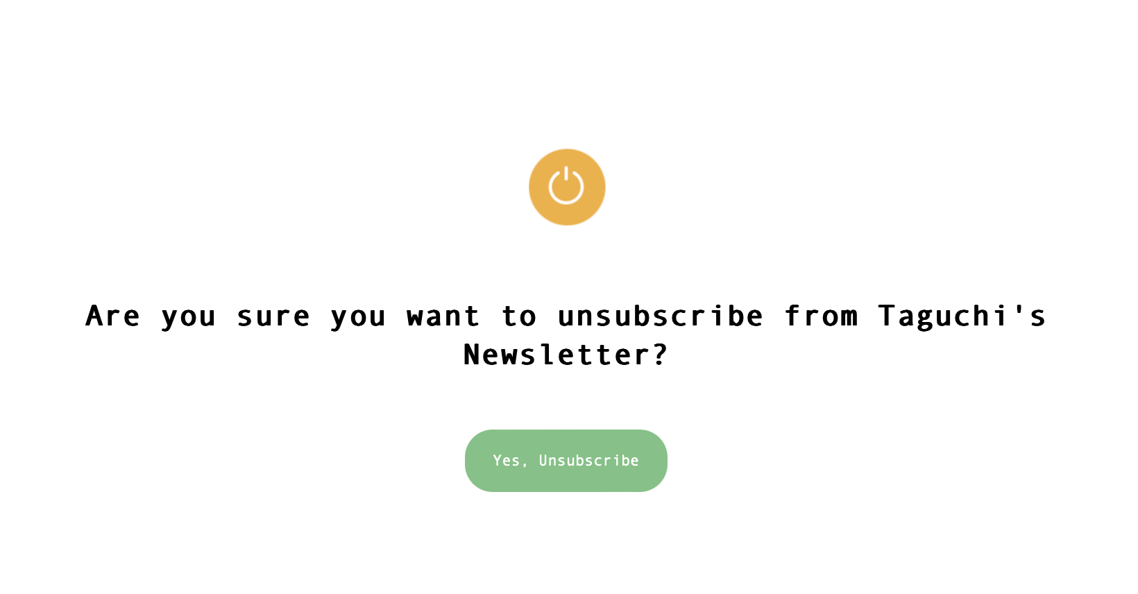
Email Unsubscribe Actions
The Email unsubscribe Actions allows you to determine how email unsubscribes should be handled. You can customise the Configuration, Unsubscribe Page and Usage sections of this theme option.
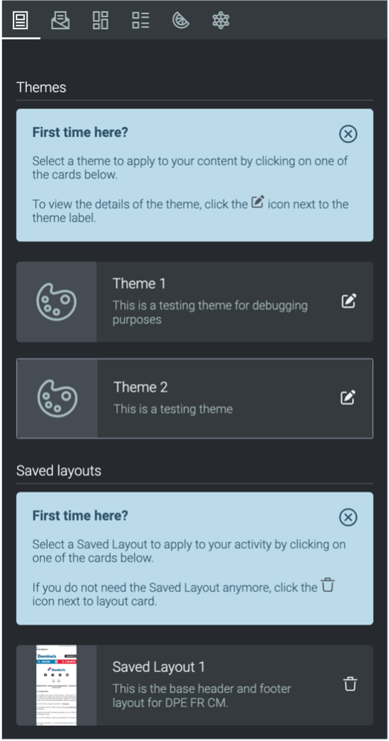
Content Theme
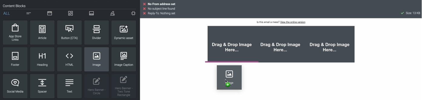
The content theme allows you to set the various default styles within the email or web template. You can customise the styles for Global items, Header, Content Blocks, Call to action buttons and Footer.
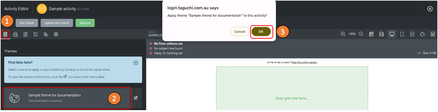
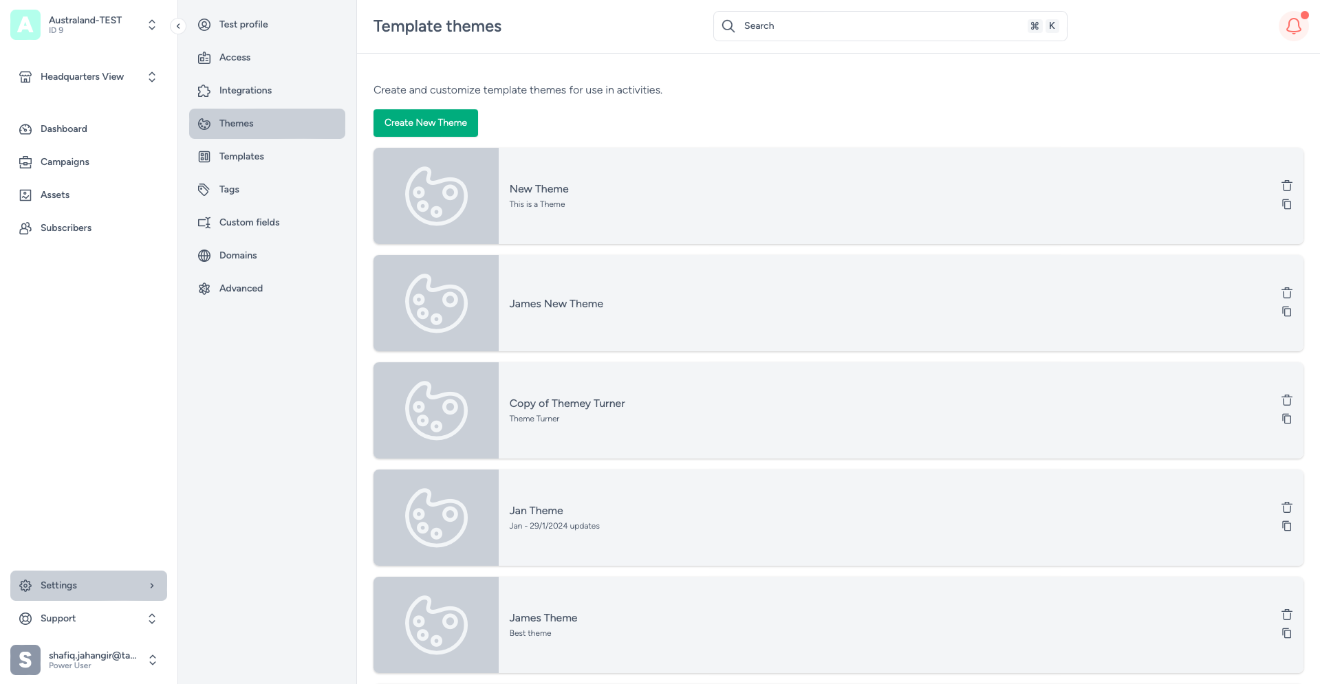
You can edit your themes by clicking on the edit icon, you will be immediately directed to the edit page of your chosen theme.
10.1 Saving A Theme
After you have created your theme, it will be stored within the settings and the activity via the Templates tab.
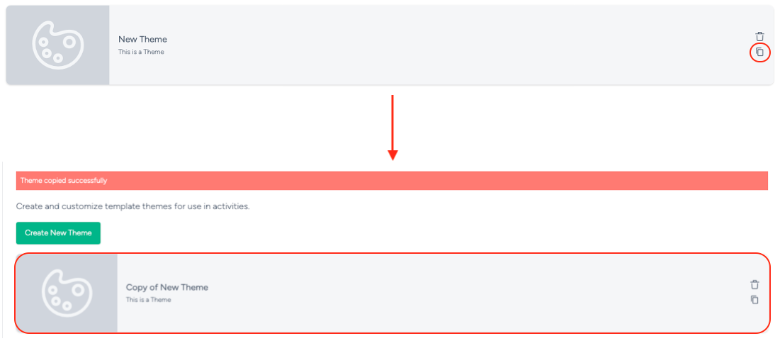
10.2 Duplicating A Theme
To duplicate (clone) your theme, head to settings and select themes. Once you are in the themes section, click on the duplicate icon located on the right of your theme to create a copy of it. The duplicated theme will be located at the top of the theme list and will have “Copy of” within its name. A notification will be displayed at the top to inform you that your theme was copied successfully.
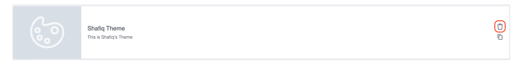
10.3 Deleting A Theme
To delete your theme, head to settings and select themes. Click on the bin button on the right of your theme to delete it. Once a theme has
been deleted, you will not be able to retrieve it again. A notification will be displayed at the top to inform you that your theme was deleted
successfully.
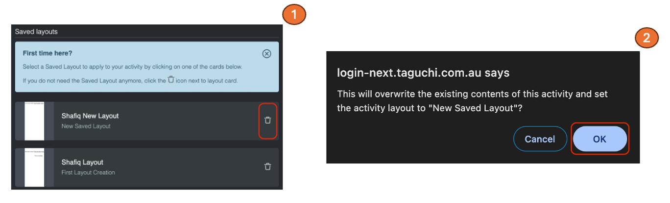
10.4 Creating A Saved Layout
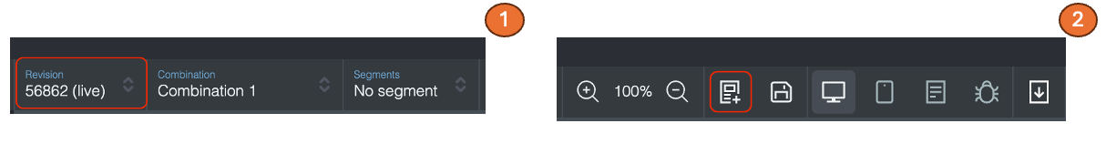
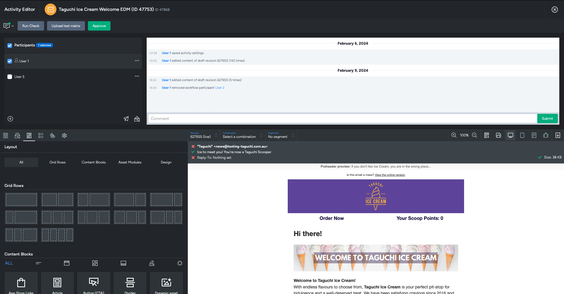
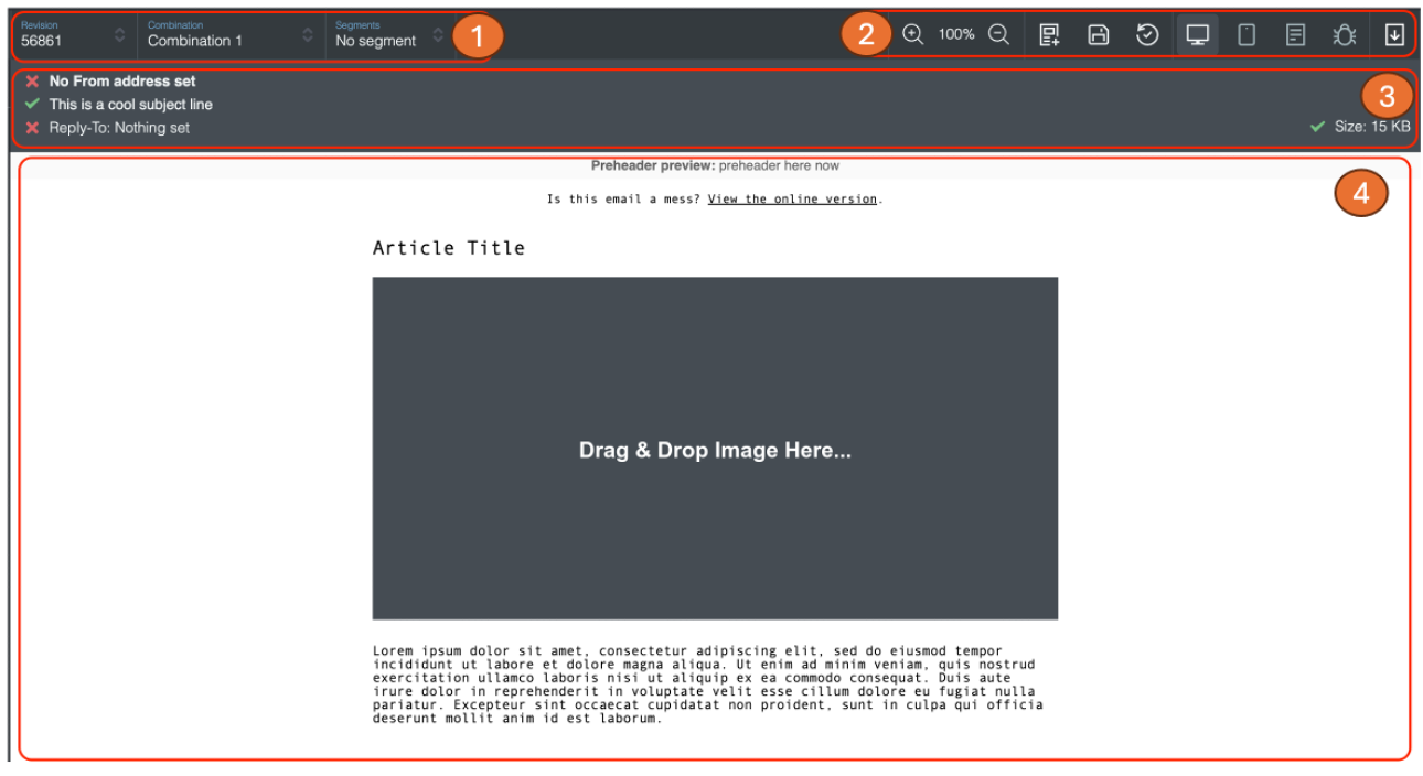
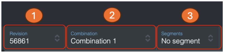
1) To create a Saved layout, choose a revision that you want to save as a layout. You can choose your revision in the revision drop down menu located at the top left of the activity preview.
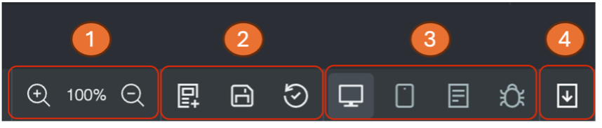
2) Click the “Save revision as a Layout” button located within the top right side of the activity preview.
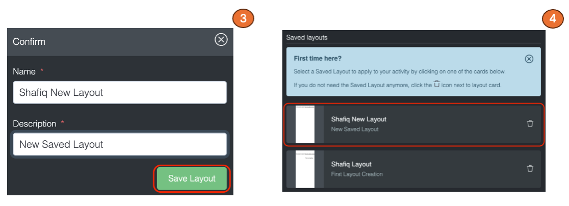
3) A confirmation box will pop up where you can enter the name and description of your new saved layout. After entering the name and description of your layout, click “Save Layout”.
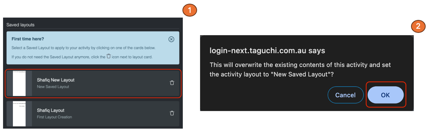
4) Your new saved layout will be stored at the top of the Saved Layout section.